— COMPANY
Cornell University
— ROLE
Product Designer
UX Researcher
— DATE
2019
As a loyal and frequent customer, I started this project with the goal of improving the Starbucks App Promotion feature.
Like many people on the go, customers use the Starbucks App to order their coffee and food. While they often use rewards points to save money, they rarely use other promotions.
Opportunity
Developing a new feature on the Starbucks App that increased the visibility and accessibility of promotions could incentivize users to purchase more items and increase revenue for the company.
Hypothesis
Starbucks App users don’t use promotions because they are hard to find and difficult to activate.
Final Prototype
Created in Figma
Existing Promotions
While Starbucks has a rewards points program clearly outlined on the home page, its promotions are housed in the inbox feature and sporadically throughout the newsfeed, which also contains articles and company updates.
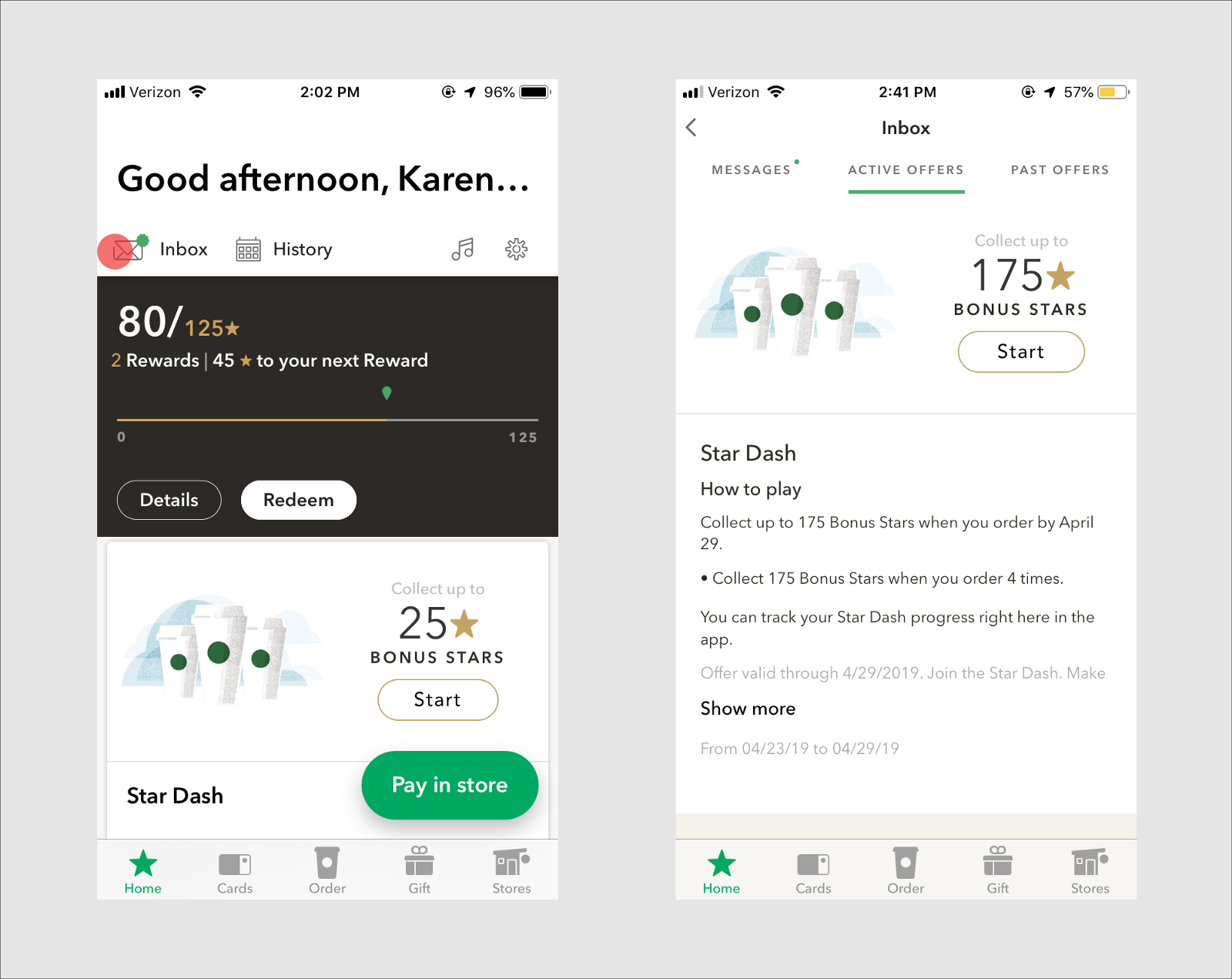
Current Promotion Implementation
User Research
By interviewing 3 users, who spanned from ages 21–60 and varied in Starbucks beverage and food consumption, I found these insights:
- The inbox feature is rarely used
- (“I’ve never used it and don’t really know what it is for.”, “I never check it”)
- Current promotion is chaotic
- (“A lot of information on the promotions section that is irrelevant”, “Cluttered” )
- Most users use pre-order more frequently compared to the in-store ordering page.
- Saving money is important.
- Many customers are loyal members and spend a lot of money at the company and will save money when they can, given it is convenient.
People Problem
Customers at Starbucks want to get the best value for their money, but they can’t do this well because they have difficulty finding and accessing their promotions.
Exploring Feature Spaces to Improve
To come up with possible solutions to this problem, I gathered a group of 2 friends to brainstorm ideas.
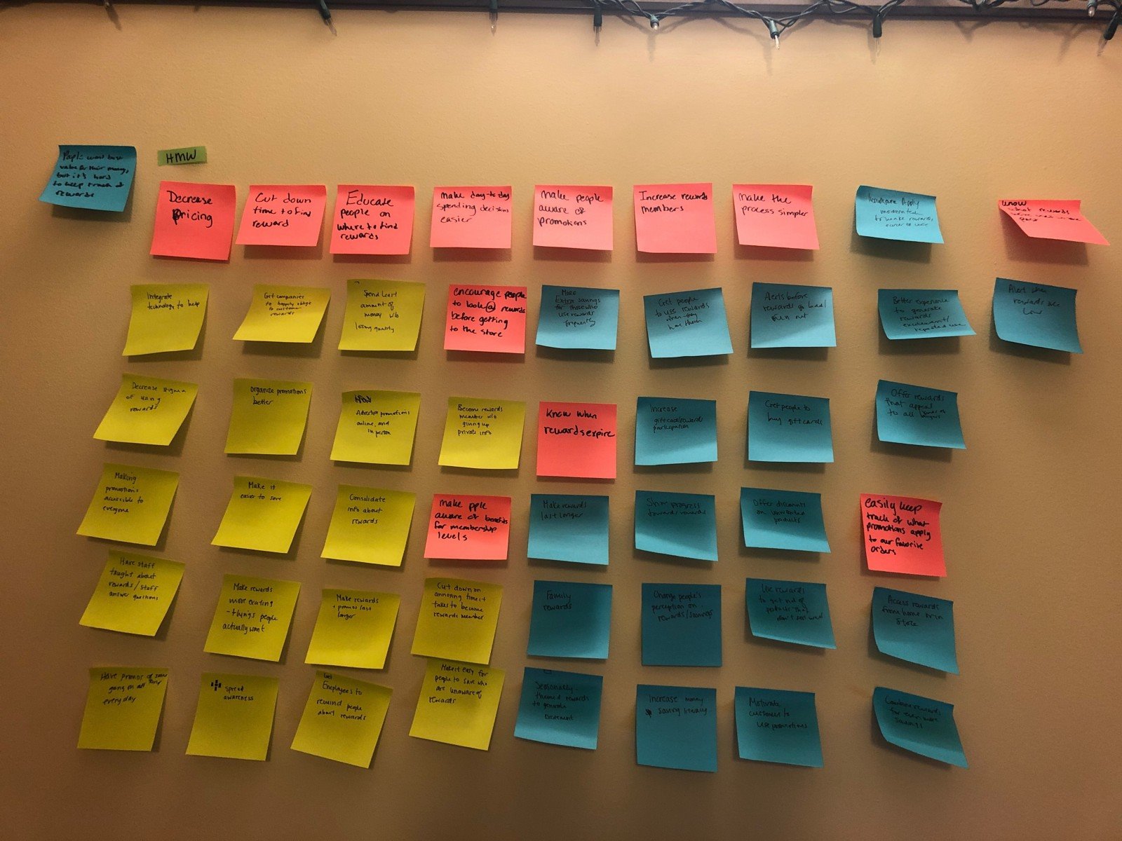
Top 3 Solution Spaces
- Rewards/Promotion Visuals: reorganizing promos into a more comprehensible way to increase visibility.
- Competition: This space encourages people to use the rewards and promotes people to spend more money at Starbucks if they’re in competition with their friends and family.
- Geolocation: An issue found in user-testing was a scenario in which users go to a specific store only to discover that the store doesn’t offer said promotion. Could promote both store and user participation.
Top Solution
A new feature for promotions in the home page and throughout the checkout process that combines new visuals and store-specific promotions.
Market Research
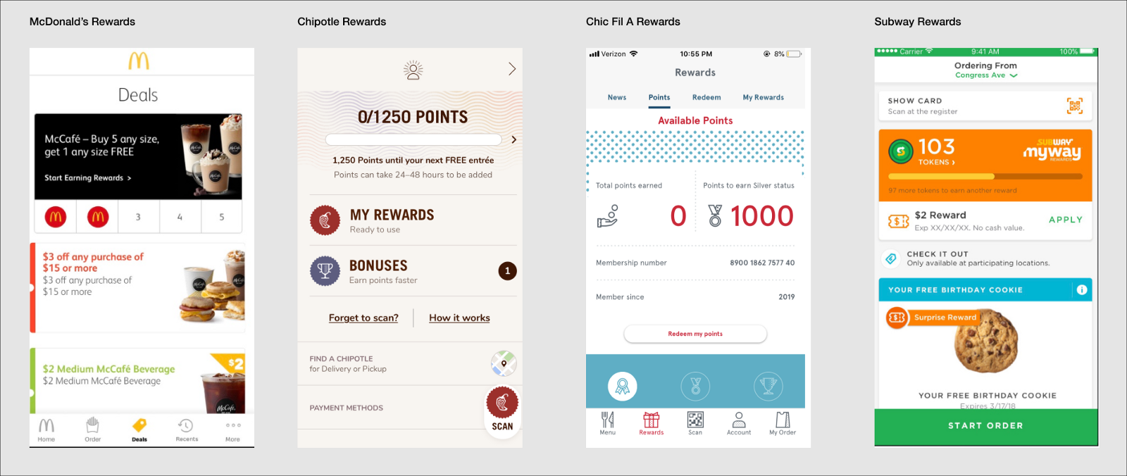
Competition Examples of Rewards and Promo Pages
Findings
Current solutions to accessing promotions are cluttered and hard to navigate. McDonald’s and Subway employ a news feed with promotion cards that you have to scroll through, while Chic Fil A has more of an info graphic for points and a separate tab for specific rewards. Chipotle on the other hand has tabs for extra rewards and bonuses. Starbucks should implement a solution that limits the amount of clicks and increases promotion visibility.
Medium Fidelities
Flow #1
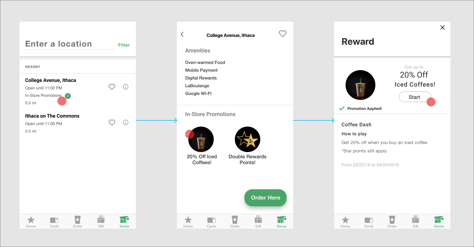
Entry Point through the home page
Flow #2
Entry Point through the Stores Tab
User Testing Insights
- Large images seem to be effective in drawing users attention.
- Users had mixed opinions on store locations promos and whether it would incentivize users to pick one location over the other.
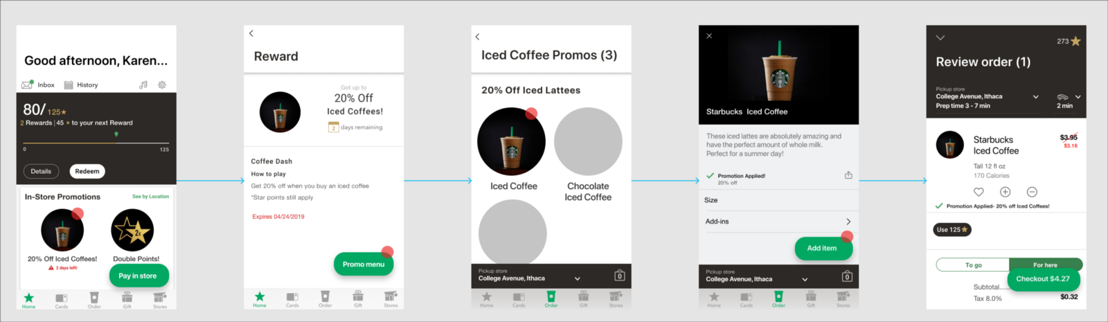
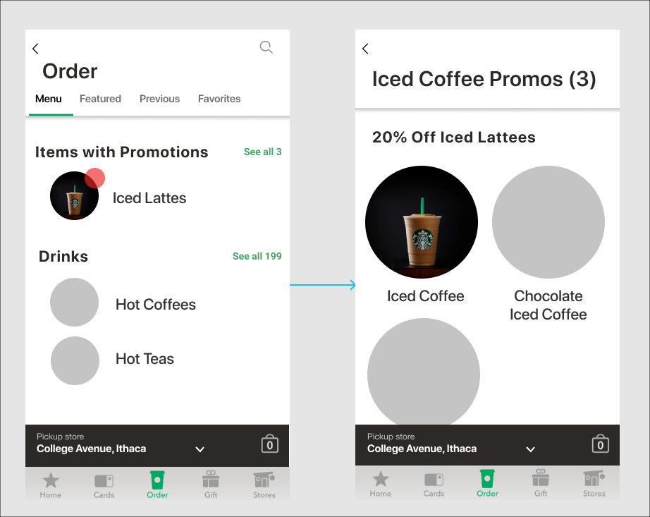
- Users don’t use the store tab often, and would prefer an additional entry point in the menu so they can see what specific items are a part of the promotion through the entire process.
Revision and New Direction
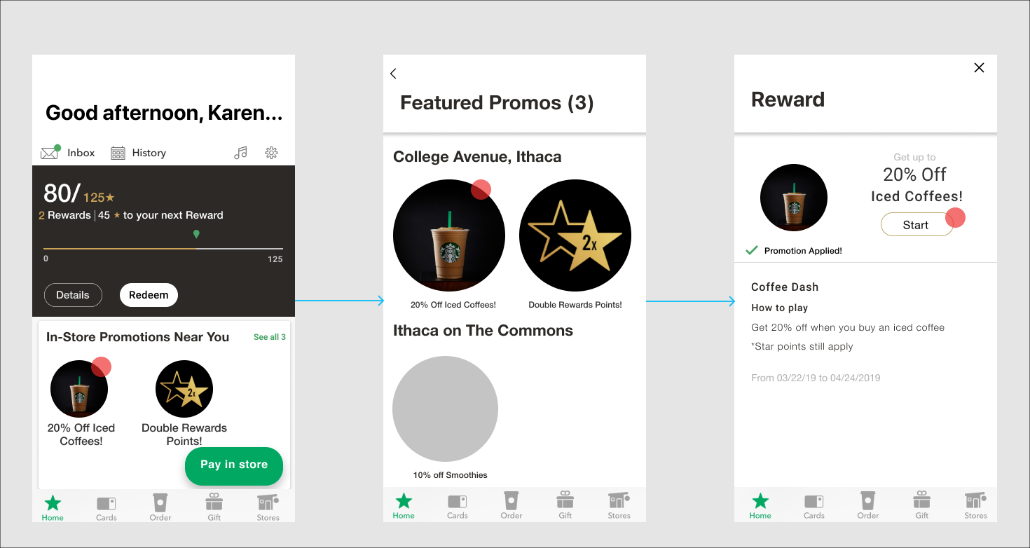
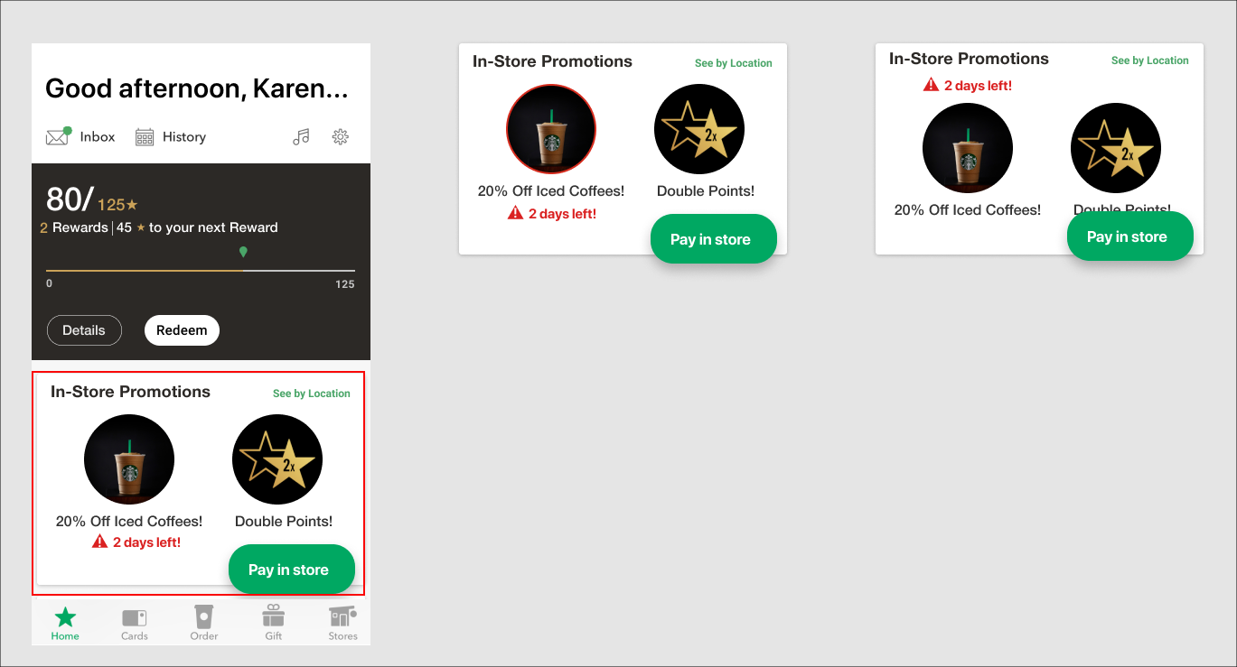
Entry point through home page, clicking directly on promotion first
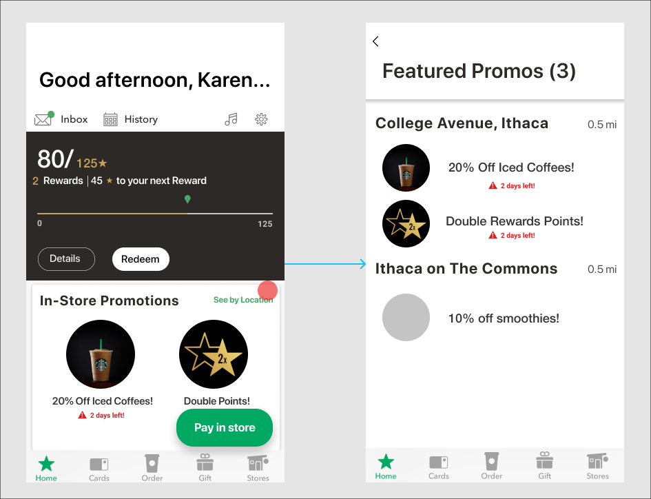
Filter by Location
Menu Entry Point
- Why This Interaction Flow?
- Increased Visibility:
- I chose to put the entry point on the home page, because that’s what the users first see when they open the app. I put it before the newsfeed because many users don’t use that feature.
- Store Promotions:
- Sorting promotions by store solves the problem of going into a store and not having the promotion apply. Having this as an option and not the main interaction solves the issue of users having mixed opinions on whether store-specific locations would incentivize them.
- Better User Interaction:
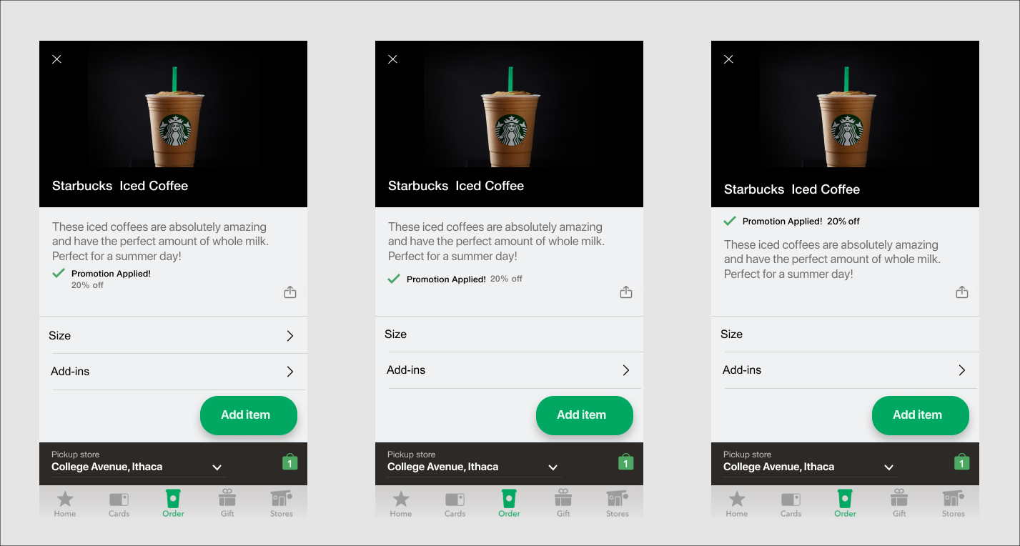
- In order to make it clear what the next step is after seeing promotion details, I included a button that says “Promo Menu”, so the user can select what items to add to their cart that go with the respective promo.
- Menu Entry Point:
- Many users often go straight to the pre-order feature and this makes promotions more visible.
- Reminders Through Check Out Process:
- Users will know which items in their order the promo has been applied to.
Visual Design
UI Kit
Grabbed color palette, fonts, and spacing rules from the existing app
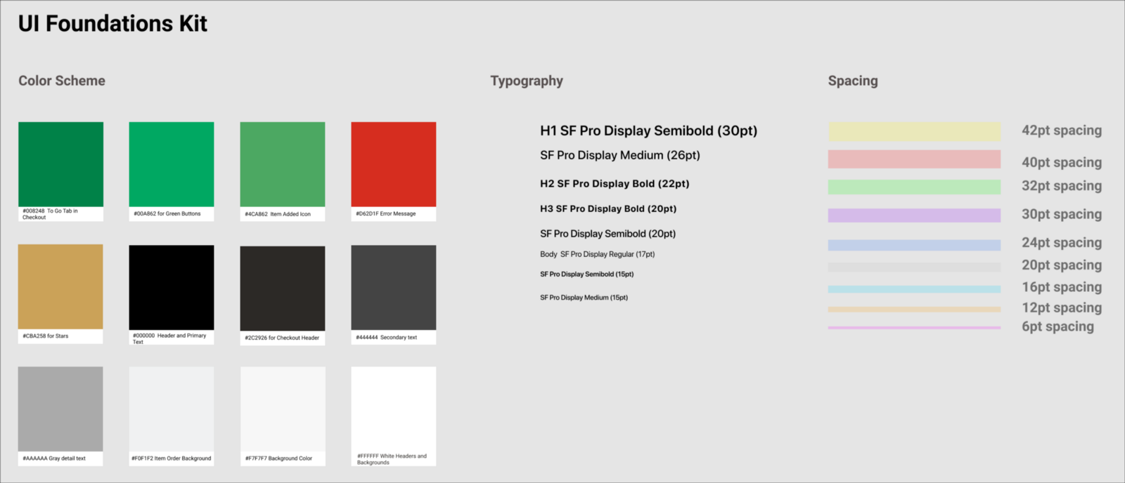
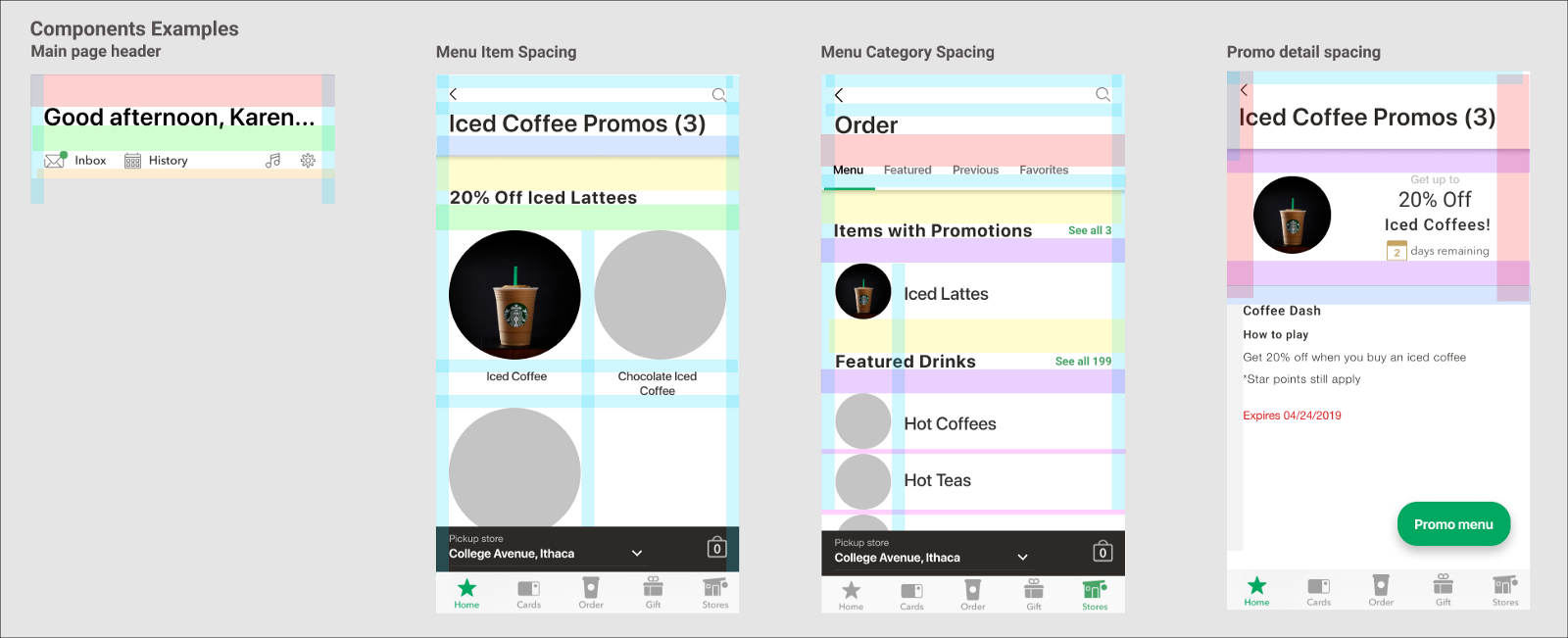
Spacing
Created spacing guidelines to simulate developer handoff
Little intro text
Error Messages
During user testing, users indicated that knowing when a promotion expires was important to them.
Error Message Visual Design Iterations
Decision-Screen #1
After surveying a few people, I found that most people preferred the first screen because it wasn’t too much color and was the simplest. The third screen was a little confusing to users with the expiration message on the top and left users searching too long for the title of the promotion.
Promo Feedback
The promotion applied sticker is meant to keep users informed throughout the ordering process about which items apply to the selected promo.
Promotion Applied Sticker Visual Design Explorations
Decision- Screen #2
I chose the second screen because of the spacing and content hierarchy. Having the promotion applied sticker after the details of the item, but before the options made it visible, but did not overpower the item information paragraph. The first screen, on the other hand, took up two lines and was therefore a little too close to being on the same level as the share item icon while the third screen had a confusing hierarchy with the promo sticker on the top.
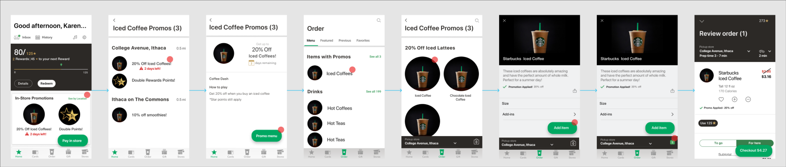
Final Flow
Conclusion
Interactions
This new feature increases the visibility of promotions while limiting the amount of clicks it takes a user to complete their pre-order, which is more frequently used than the in-store payment feature. The menu option is not only linked through the home page promotion details screen, but is meant for users who automatically go to the order tab first. Users also have an option to filter promotions by store-location, which will clear up any confusion about whether the promo applies at each store.
Design
Because I modeled the new feature designs based on existing color, font, and spacing styles in the Starbucks app, if this feature was launched into production, users should have an easy transition from the older version of the app.